Why do we visualize our data, and why should we try to move beyond crosstabs (or tables)?
So often end-users will ask for a table, not unlike Excel (which they may be more familiar with).
But finding you answer quickly in a table is not easy.
The human brain is able to store roughly 7 items, and sometimes less, in their short-term memory.
Scanning a table for information is stretching our capabilities as a human, and will require more effort.
A classic example is comparing number within a table or comparing them within a graph.
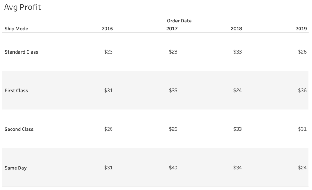
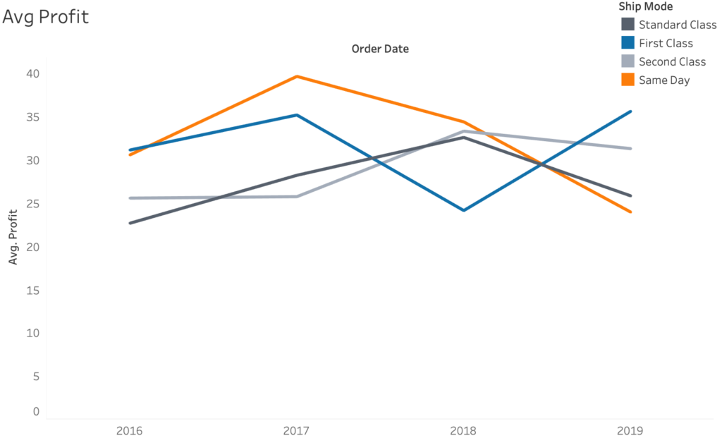
Which shipping mode has decreased the most in average profit?
Have a short look at the table below

And now have another look at the line chart below

If you could choose which representation you could use, which would be easiest to make the comparison?
Most people would chose the graph which is not strange considering here you would only need to compare 4 patterns.
Whilst the table would require you to remember 16 numbers, which is difficult considering we can usually remember around 7 items using our short-term memory.
This is one of the reasons why we visualize data, to show the pattern within the data and help overcome the memory limitations of our brain.
I hope this blog I shared can be useful for you! If you want to know more about you can read part one. You can also learn more about visualising for colour blind end-users in this blog.
Would you like to learn more about dashboard design and visual analytics? We regularly host a dedicated training about this, click here for more info!
In need of further explanations and help? Don’t hesitate to contact us, join our workshops and trainings or hire a consultant!
Header image from: Andy Kriebel (@VizWizBI) Screenshots from author.

