Why do we visualize our data?
So often end-users will ask for a table, not unlike Excel (which they may be more familiar with), with summarized data.
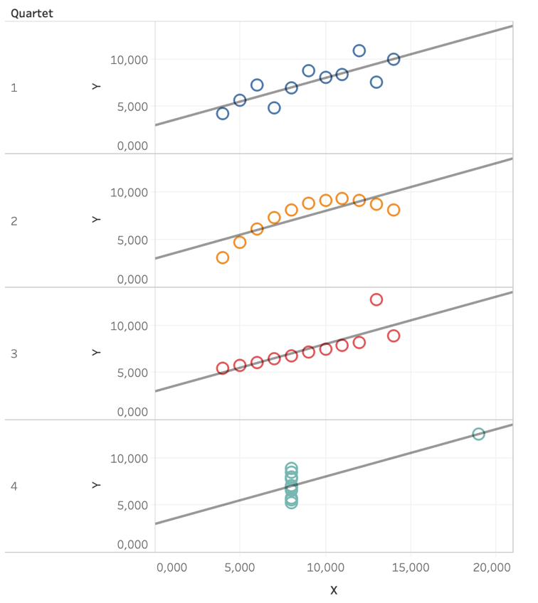
French statistician Francis Anscombe created four datasets to show why we should first visualize information before analyzing it.
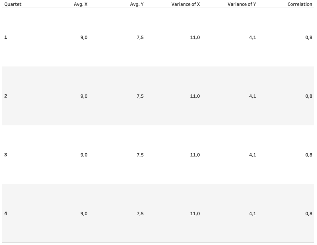
The four datasets he created all have 11 x and y coordinates and all show the same summary statistics.
And thus when only compared on those merits would be deemed the same.

But when plotted we see how very different the datasets really are

This is one of the reasons why we visualize data, to show the pattern within the data before we summarize and draw conclusions.
I hope this blog I shared can be useful for you! If you want to know more about you can read part two. You can also learn more about visualising for colour blind end-users in this blog.
Would you like to learn more about dashboard design and visual analytics? We regularly host a dedicated training about this, click here for more info!
In need of further explanations and help? Don’t hesitate to contact us, join our workshops and trainings or hire a consultant!
Header image from: Andy Kriebel (@VizWizBI). Screenshots from author.


