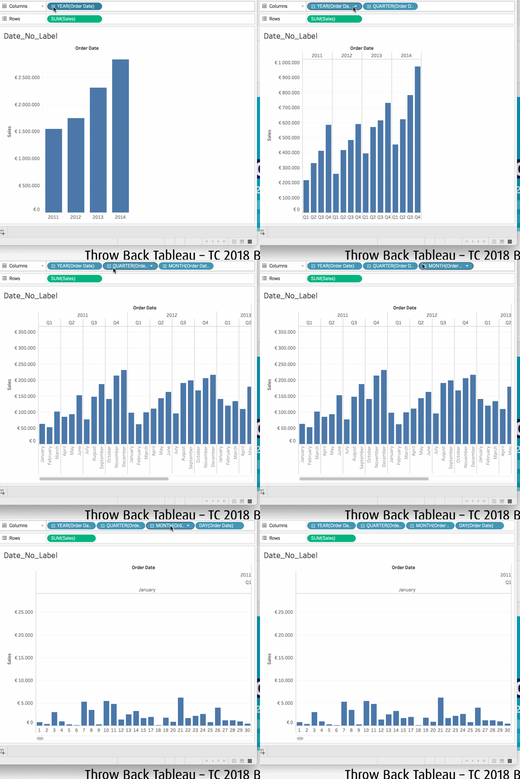
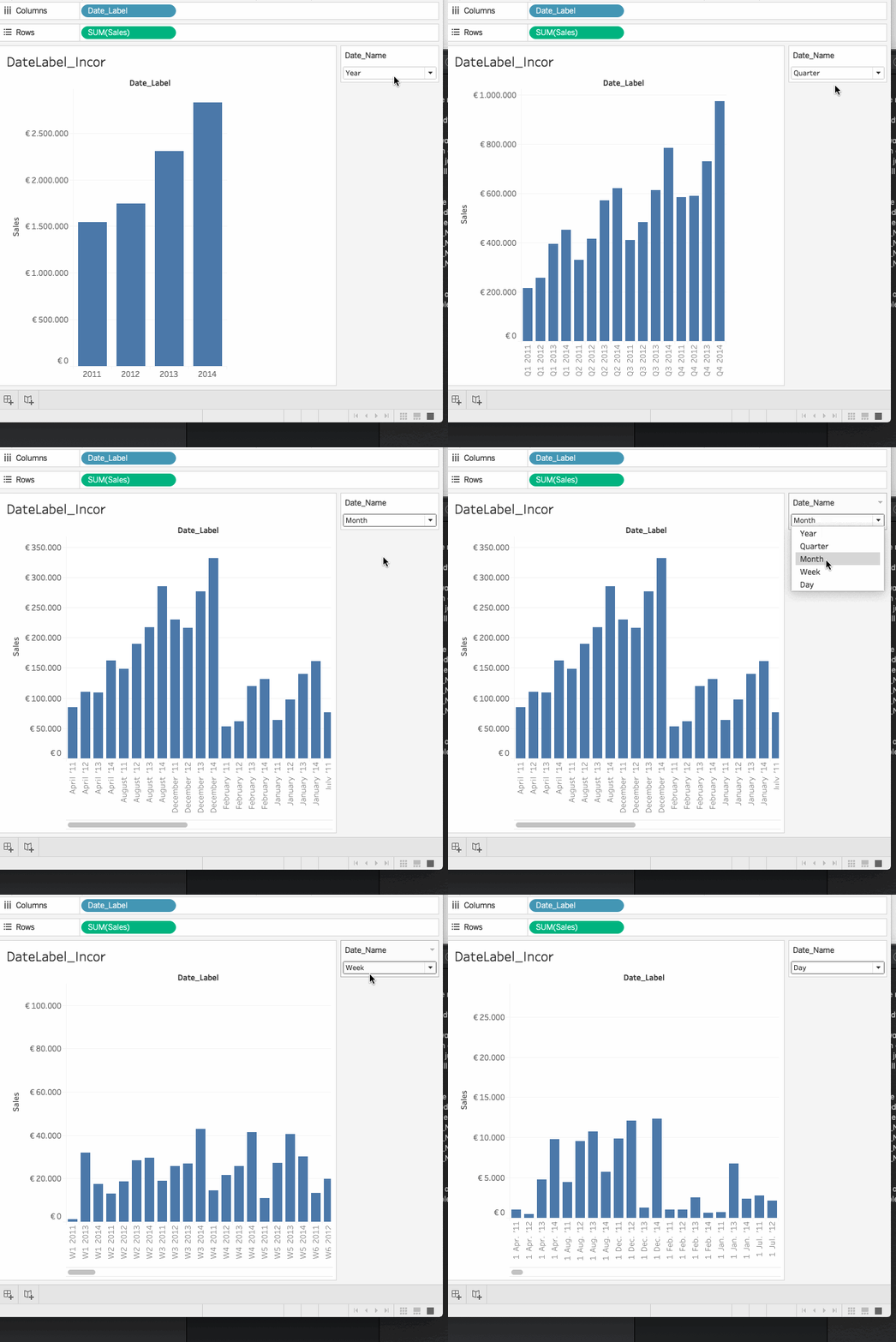
In this blog I will discuss how to create a dynamic date label within your viz.
Dates are always interesting whilst creating a viz as people treat dates differently.
Do I create it as a drill down or use a parameter to choose the detail level?
The drill down option works great, but not everyone likes the automatically created “extra” headers, or the loss of flexibility of ‘Date format’.

So what if we just want 1 header for our dates, which we can alter with a parameter and also have dynamic formatting?
As the formatting on our date we see in a viz is in essence a label, we can create our own date label field to use. And we’ll create it in such a way that it responds to a parameter set to ‘ Day’, ‘Week’ etc.
The calculated field could look something like
IF [Date_Name] = ‘Day’ THEN str(DATEPART(‘day’,[Order Date])) +’ ‘+ LEFT(DATENAME(‘month’,[Order Date]),3)+’. ”’+right(str(DATEPART(‘year’,[Order Date])),2)
ELSEIF [Date_Name] = ‘Week’ THEN ‘W’ + str(DATEPART(‘week’,[Order Date]))+’ ‘+str(DATEPART(‘year’,[Order Date]))
ELSEIF [Date_Name] = ‘Month’ THEN DATENAME(‘month’,[Order Date])+’ ”’+right(str(DATEPART(‘year’,[Order Date])),2)
ELSEIF [Date_Name] = ‘Quarter’ THEN ‘Q’ + str(DATEPART(‘quarter’,[Order Date]))+’ ‘+str(DATEPART(‘year’,[Order Date]))
ELSEIF [Date_Name] = ‘Year’ THEN str(DATEPART(‘year’,[Order Date]))
END
Now we have our own dynamic label with the dates of our choice. We can now easily use it in our viz.

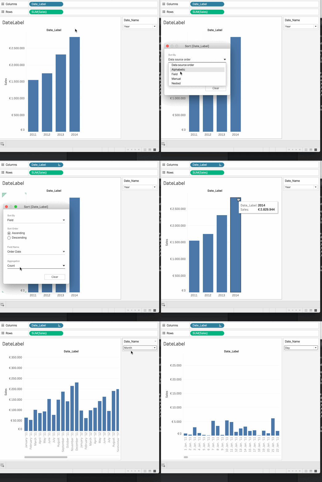
The only problem is the order in which the label is shown. As we are now working with string variables using the standard order will not show us a normal passage of time (as you can see in the above gif). Q1 is always first despite the year, when looking at Months we always have April first etc.
So let us change the order, and use the original Order_Date to order our Date_Label field. As our label is based on an original date field, we can order it by the minimum of that datapoint. Like this:

And there you go! Now we:
- Have 1 header for our date
- Can alter the granularity of our date
- Have dynamic formatting of the date label on our axis
This is just a short exercise to show that thinking flexibly about your data and labels can give you extra options in your viz.
If you would like to look at the inner workings more closely you can have a look here
Next time I’ll show you how you can show your end-user wether a datapoint in your viz is rounded up or down. Which can be important when treating large numbers in a KPI-dashboard.
I hope this blog I shared can be useful for you! If you have any more questions don’t hesitate to contact us.
In need of further explanations and help? Join our workshops and trainings or hire a consultant!
Header image from: unsplash.com. Screenshots from author.

